Mobile Banking App Redesign UI/UX Case Study
Mobile Banking App Redesign UI/UX Case Study
Step into the future of finance with HelloMe Money—the UK’s neo-banking marvel. This platform makes money transfers easy. It avoids the usual bank hassles. It’s fast, affordable, and easy to access. It offers real-time payments and instant KYC worldwide. Plus, its sleek, mobile-first experience is just a tap away, offering seamless access on any device
At Pixelfit Digital Agency, we donned our creative capes to transform HelloMe Money. We designed and developed it with great attention to detail. We ensured that the user experience integrated seamlessly with the backend. Our mission? Our goal was to build a fintech solution that’s simple, secure, and designed for global scale.
Challenge
As a design agency, we knew that great UX/UI is critical for fintech success—but HelloMe Money had to overcome serious design challenges:
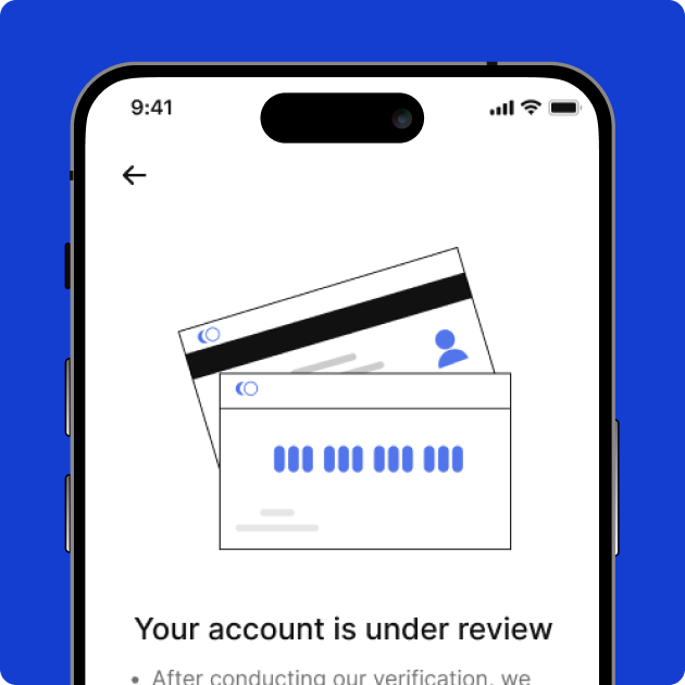
Confusing Onboarding Flows Users often dropped off during long, unclear KYC steps. We needed to simplify identity verification without sacrificing compliance.
Lack of Visual Trust The brand had to feel secure and professional—every screen needed to build confidence in the platform.
Cluttered Interfaces Many competitors overwhelmed users with too much info. We had to reduce noise and prioritize key actions.
Poor Mobile Usability Fintech users expect fast, intuitive mobile experiences. We needed a design that worked beautifully on any device.
Compliance in the UX The interface had to follow strict UK financial laws yet remain simple and user-friendly.
Solving these design problems was essential to building a fintech product people would trust—and want to use every day.
Category
App UI/UX
Start Date
5 February 2023
Clients
Kennedy Oduko
Location
New York City
The Problem
As a design agency, we knew that great UX/UI is critical for fintech success—but HelloMe Money had to overcome serious design challenges:
Confusing Onboarding Flows: Users often dropped off during long, unclear KYC steps. We needed to simplify identity verification without sacrificing compliance.
Lack of Visual Trust: The brand had to feel secure and professional—every screen needed to build confidence in the platform.
Cluttered Interfaces: Many competitors overwhelmed users with too much info. We had to reduce noise and prioritize key actions.
Poor Mobile Usability: Fintech users expect fast, intuitive mobile experiences. We needed a design that worked beautifully on any device.
Compliance in the UX: The interface had to follow strict UK financial laws yet remain simple and user-friendly.
Solving these design problems was essential to building a fintech product people would trust—and want to use every day.
The Solution
At Pixelfit Digital, we approached HelloMe Money with a design-first mindset, making sure the product felt secure, easy to use, and ready for real-world banking needs.
User-Centered Design: We crafted clean, intuitive interfaces that guide users step by step—from onboarding to transactions—removing friction at every point.
Simplified KYC Flow: We redesigned the identity verification process to be quick, mobile-friendly, and easy to complete, improving conversion rates.
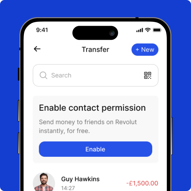
Clear Visual Hierarchy: Key actions like “Send Money” and “Check Balance” are front and center, reducing confusion and boosting usability.
Mobile-First Experience: We built native apps that work fast, look sharp, and feel natural on both iOS and Android.
Trust-Driven Aesthetics: Every design choice—color, typography, spacing—was made to reinforce a sense of security and professionalism.
Compliance Without Complexity: We designed flows that meet UK financial standards without overwhelming users.
Our design solution didn’t just look good—it worked. It helped HelloMe Money earn user trust, simplify finance, and scale fast in a competitive market.
Designing a Seamless Cybersecurity Experience
Designing a Seamless Fintech Experience
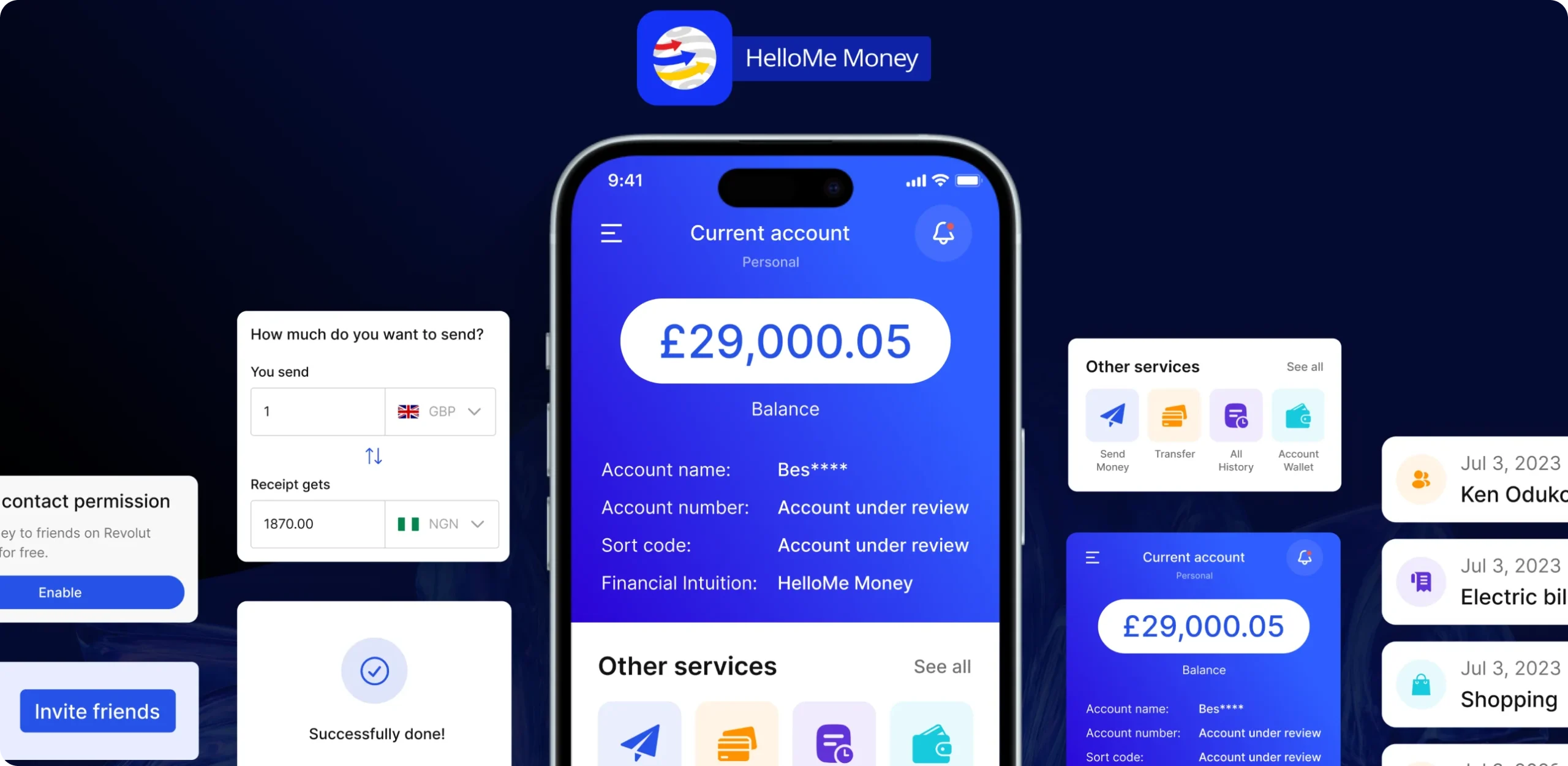
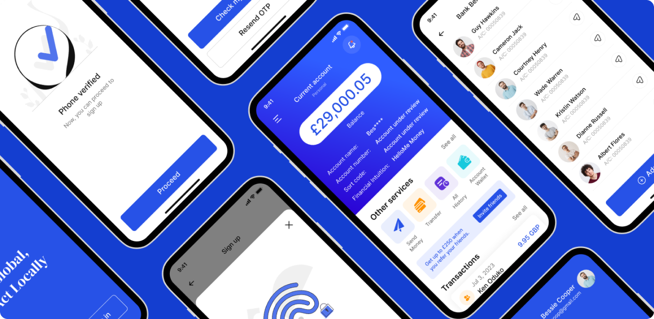
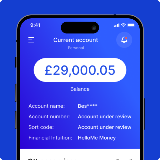
At Pixelfit , we designed HelloMe Money to deliver what today’s users expect from a modern digital banking app speed, simplicity, security, and a smooth user experience from the very first tap. Whether you’re a first-time user or a frequent international sender, the platform is built to be intuitive, mobile-friendly, and ready to scale.
Quick KYC Onboarding We streamlined the identity verification process, allowing users to complete KYC in minutes—no paperwork, no long waits.
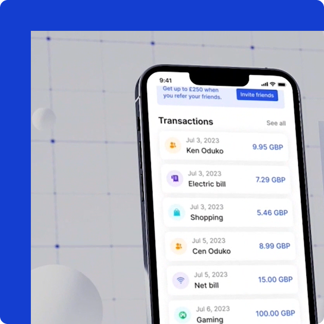
Mobile-First Fintech UI Every screen was built with mobile banking in mind. Users can send money, track transactions, and manage accounts effortlessly on any device.
Fast, Borderless Payments Transactions are transparent and instant—no hidden fees, no confusion, just simple and secure money transfers across borders.
Scalable Fintech Architecture With future growth in mind, the platform is designed to seamlessly support new features, handle increased user activity, and facilitate expansion into new markets.
For fintech, good design is about more than just looks—it’s about earning trust, making things easy, and giving users confidence with their money.